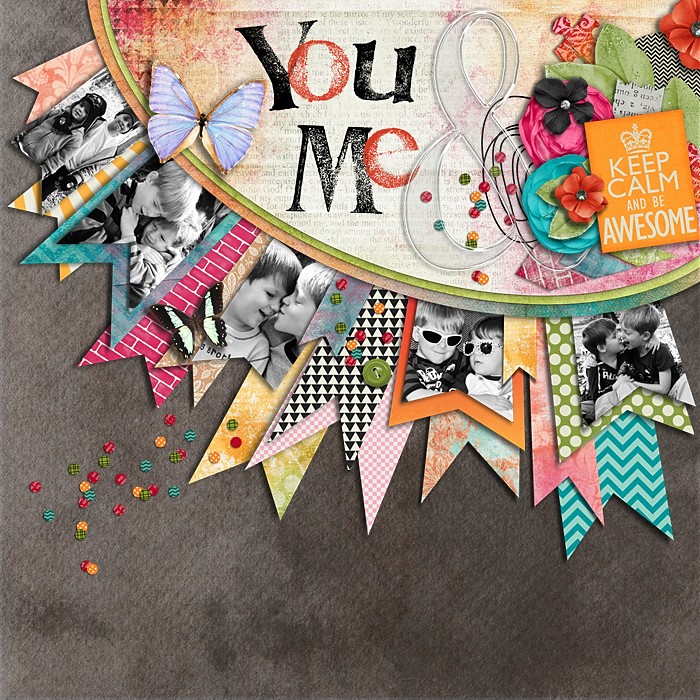
Recently, I was scrolling through my Pinterest board looking at what projects had been repinned the most. I was shocked to find that one of the layouts that I had pinned has been repinned 1,484 times (as of when I'm writing this post). None of my other scrapbooking pins can even come close to that number.

This layout was created by Libby Pritchett. I think that she's a digital scrapbooking designer. I decided that I would recreate this layout using my own supplies and my own style. There are a few things about this layout that made me think that I would not like the end result of my project. The first thing I noticed was that the photos were cut unto shapes. I rarely, if ever, cut my photos into shapes. If I do cut my photos into shapes its a square or a circle, that's it. When I was creating this layout I even thought about trying to rework the design a little bit so I could avoid cutting my photos but the further I got into the project I decided that I would stick with the original design. I cut my photos into a pendant shape *gasp* and I LOVED how it turned out *even bigger gasp*
I used the Bella Blvd Family Forever Collection
And here's the final project:
I did a couple of things differently on my project. I added a border sticker toward the bottom of the page. It felt a little more 'balanced' to me with the sticker at the bottom. I also didn't use as many photos on my project. I wanted it to be about my kiddos and I have three kiddos so naturally I have three photos on my layout.
I gave this basic idea a second try using the same concept but switching things up a bit. I came up with this last night:
This layout is a combination mainly of 2 collections (Gramercy Road by Gossamer Blue and Crate Paper's Open Book collection).
Have you ever scraplifted a layout you found on Pinterest? This is the first time I've done it and I love the results, you should give it a try!


I LOVE both of these layouts you made Becki!! STUNNING!
ReplyDeleteThese are so beautiful, Becki!
ReplyDeleteLove this idea and gorgeous LOs!!
ReplyDeleteBecki, these are beautiful. I love your choice of papers and a great way to use up some scraps!
ReplyDelete